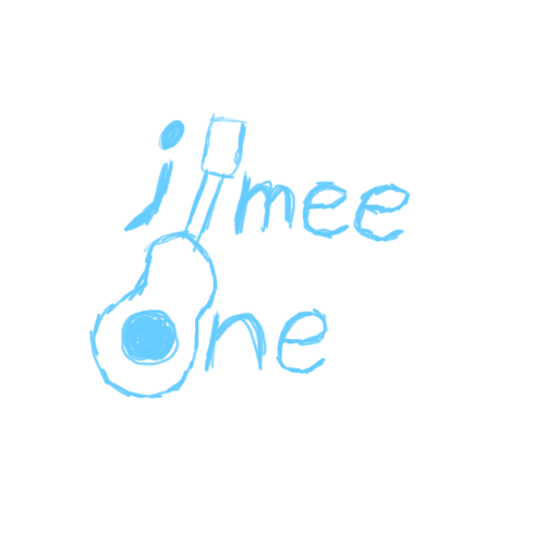
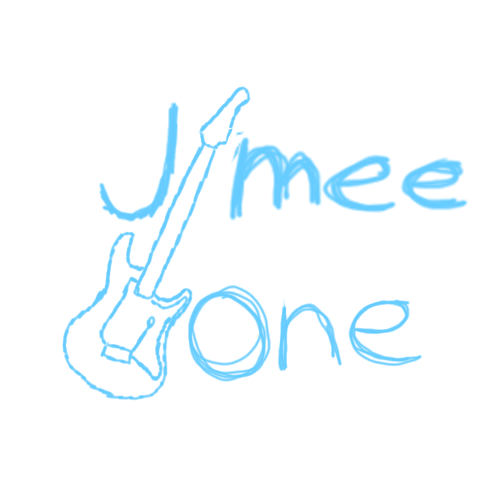
This is a base sketch done in Adobe Photoshop using a Huion tablet. The idea was for the neck of the guitar to mimic the letter 'i' and the hole in the body to take the place of the 'o' in Jimee and One, respectively.
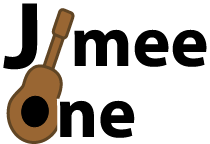
This is the first version of the logo I drafted using Adobe Illustrator. I chose to use the default font, Myriad Pro, to give the logo a contemporary and casual aesthetic. I outlined the type in white to allow it to show well on any background, especially dark backgrounds, for potential merchandising and branding uses.
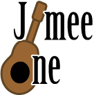
This is the second version of the logo I created also using Adobe Illustrator. For this version, I chose the typeface Birch Std. for its unique serifs and to give the logo a more mature feel without making it feel old or outdated. Again, I have outlined the type in white to allow it to show up on any background or product.
At the client's request, I also made a version using an electric guitar instead of an acoustic. Due to the natural 'O' shape no longer being present, I chose to spell the entire word, though I kept the idea of the neck of the guitar replacing the 'i'.
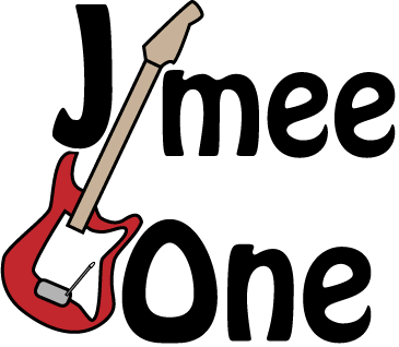
The first version of the logo had the guitar as a rich red color since that's a popular color choice for electric guitars. The typeface I chose to use for this version of the logo is Hobo Std due to it's unique letter shapes and stylized counters, giving it a contemporary and humanist look.
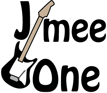
I also created a version with the guitar black so it matches the letters. For this version, I outlined the body of the guitar to match the letters and so it would be more visible on dark backgrounds.