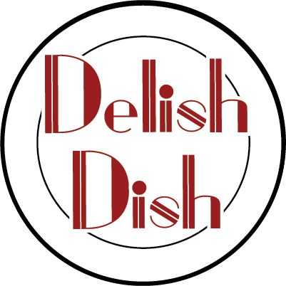
I designed this logo for my mother's personal chef and catering business, Delish Dish. The typeface used is one that I personally designed and created myself from scratch specifically for the use of her business, which I named Mom's Kitchen. This particular instance of the font has been modified with white lines striking through the center of some of the thicker parts of the letters.
I chose a sans serif fat face style because I wanted to give the impression of an old school diner or old fashioned eatery. The red I used is a brand color. I chose a deeper, richer red instead of a more saturated red both to avoid eye strain when looking at it and to give the logo a more mature vibe.
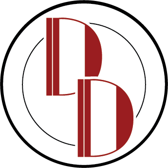
In addition to the primary logo featured above, I created a custom monogram for use in places where the logo would potentially lose readability. It uses the same modified custom font as the main logo with the two D's overlapping diagonally to give it more character as opposed to positioning them side-by-side and keeping them separate.
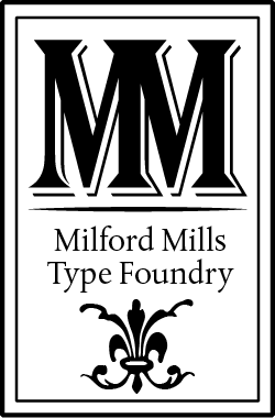
This is a logo I designed for a fictitious type foundry. The MM is made of two capital M's from the font Algerian Condensed Std. I chose Albertina MT Std for the name of the company, and the decorative glyph is from the font Bodoni Ornaments.
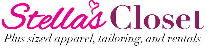
Stella's Closet is a fictitious clothing company that's marketed toward colleged aged woman and women in their mid to late thirties. I used the font Alex Brush for "Stella's" and slightly modified some of the metrics and the capital S, and for "Closet" I chose the font Didot. The logotype is the italicized version of Didot. I picked magenta for Stella's name and paired it with a deep, rich plum color in Closet to give the logo a youthful appearance without appearing immature or childish. I used a stylized heart in place of an apostrophe to give the logo more personality.
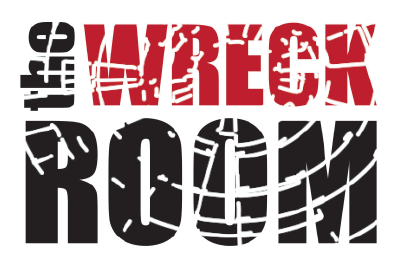
The Wreck Room is a business inspired by places such as the Anger Room and the Smash Shack where people pay for sets of items to break in soundproof rooms as a way to relieve stress. I chose to go a bit literal with the logo's design and make it look broken or "wrecked" instead of defining what kind of establishment it is with additional logotype.
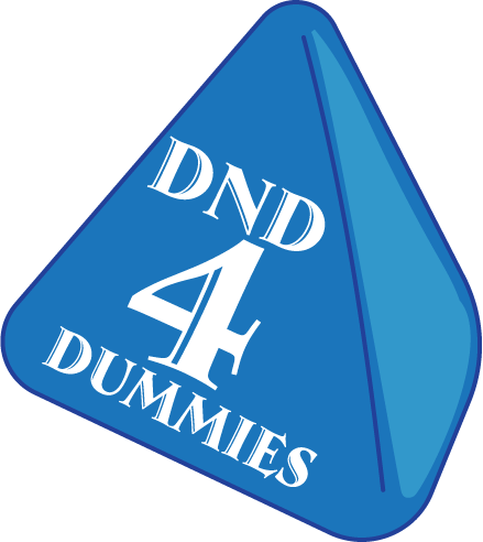
This is a logo I created for a Dungeons and Dragons channel on youtube that focuses on educating people of the different aspects of tabletop roleplaying. I modeled the logo after a special die called a D4 that is iconic to the genre of gaming and instantly recognizable to those that are familiar with tabletop gaming. The font I used is called Ambrose Std, and I chose it because I wanted something that looked dramatic and old-fashioned like the type of lettering you see in the gaming manuals and collateral without losing legibility.
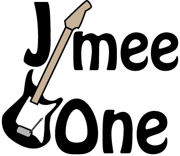
This is a logo for a guitarist who goes by Jimee One. I chose the font Hobo for this logo to match the client's laid back feeling. The neck of the guitar takes the place of the letter I to tie in the guitar as both a graphic and typographical element.

This logo is for a Christian business called "Revival in the Pews" and their non-smoking division. Specifically, this branch of their company focuses on sponsoring people that seek to quit smoking through religious encouragement, the sponsor being referred to as a quit coach.