
I was commissioned to design a logo for a small music group called Desert Fuck Entertainment. My client mandated that a cactus be included somewhere in the logo due to its universal association with the desert.
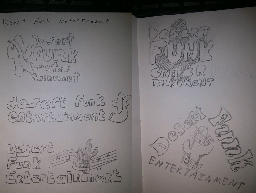
These are a selection of the initial sketches for the logo design. It was difficult to find the right balance at first since Entertainment is such a large word compared to Desert Fuck, so I tried my best to arrange the words and letters in a way that felt and looked natural.
In the end, the bottom left and bottom right logos were chosen by the client to move forward to digitalization.

This is my first iteration of their logo. I was given the color scheme of red, black, and white to work with. The typeface used is a free font I downloaded called Husky Stash. I chose husky stash because I felt it perfectly fit the funky, old school style the client was looking for.

This is the second iteration of the logo. I decided to experiment with diversity in the design by having only the words Desert Funk stylized while putting Entertainment in a simple sans serif typeface. The typeface used for Desert Funk is also a free downloadable font; it's called Spacearella. Although it has a futuristic look to it, I felt that it also showcased a funky, almost psychadelic feel that fit the client's preferences.

In the end, the first design was chosen to move forward to the final stage. I added thorns to the cactus to make it look more realistic and recognizable as a cactus to finalize the design.